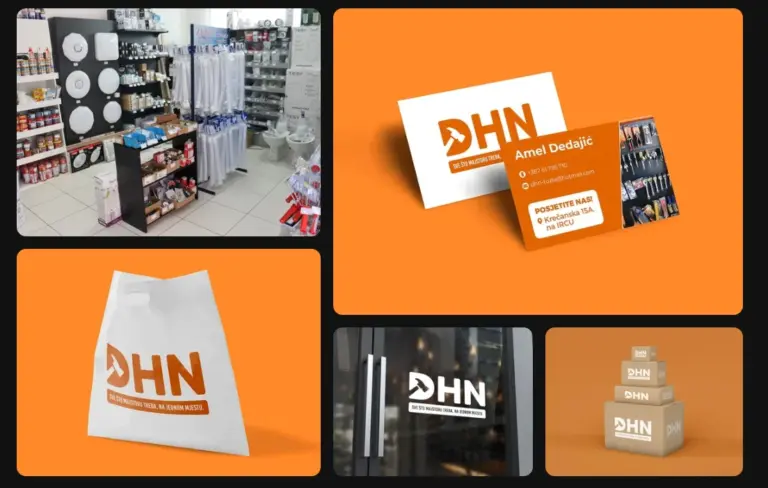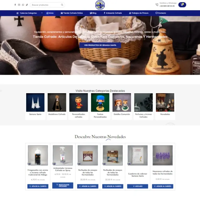
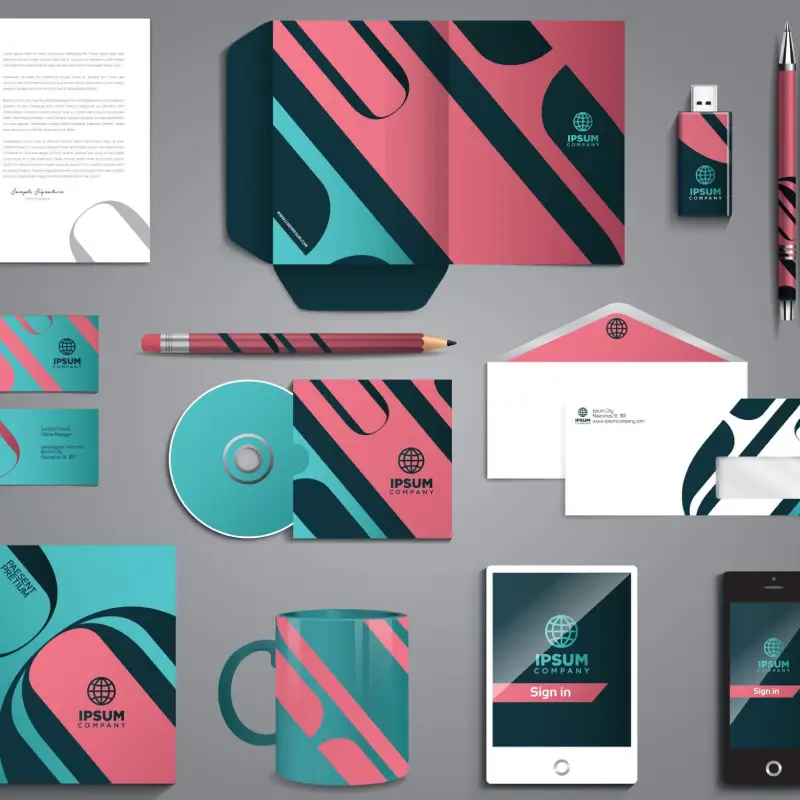
The visual identity and graphic design project for a local business in Sanlúcar de Barrameda endowed an established regional company with a distinctive, enduring, and modern brand image that authentically communicates its professionalism, proximity, and premium service quality.
The Direct Business Value of Professional Brand Identity
In local retail and trade services, customer perception of quality directly dictates consumer trust and their willingness to pay fair prices for exceptional work. The enterprise had been operating with an outdated logo created over a decade ago, suffering from mismatched typography, irregular color codes, and poor visual presentation across invoices, vehicle signage, and uniforms.
The company’s leadership recognized that scaling their commercial operations demanded an authoritative, cohesive visual identity capable of setting them apart from local competition.
Developing a Versatile, Comprehensive Corporate Identity System
Through our dedicated graphic design and branding expertise, we created a comprehensive visual brand ecosystem:
- Distinctive Responsive Logo: Engineering a refined typographic mark and emblem versatile enough to scale flawlessly from tiny smartphone favicons to massive warehouse building signage.
- Standardized Corporate Color Palette: Defining primary, secondary, and neutral color systems with precise CMYK, Pantone, RGB, and HEX specifications for error-free physical print and digital rendering.
- Commercial Fleet and Vehicle Livery: Designing high-impact, professional vinyl vehicle wraps that transform company service vans into mobile advertising assets throughout the region.
- Uniforms, Stationery, and Packaging: Branded work apparel, business cards, work order forms, folders, and branded packing collateral that reinforce quality at every customer touchpoint.
- Brand Identity Guidelines Manual: A comprehensive manual outlining minimum clearance margins, incorrect usage rules, typography pairings, and layout grids.
Competitive Differentiation and Brand Equity
The new identity elevated customer perception immediately, allowing the company to command premium rates and win competitive commercial tenders with confidence. This project laid the visual groundwork for their ongoing social media management campaigns featured in our directory of creative case studies.
Designed for Durability and Scalable Horizons
The minimalist, balanced geometry of the brandmark avoids fleeting design trends, ensuring the visual identity remains fresh, authoritative, and relevant for years of business growth.